Preface: I originally intended to finish this, or at least go further than the taskbar. I also wrote it nearly a year ago, so things may have changed in the meantime. Though in my not-extremely-thorough testing, they haven’t.
Normally I’m an “as-early-as-I-can” adopter.
Now I hate that a downgrade requires a complete format.
Just a warning here: I am a bit salty about this whole thing.
At least I didn’t ruin my desktop with this, since my CPU isn’t on the list of supported processors. I’m not sure if that’s good luck or poor development, but it meant I couldn’t get the automatic update through Windows update.
But then I realised that if my Surface Pro 7 didn’t support it, there had to be something wrong (maybe more wrong, considering my desktop) with Microsoft. There is something wrong with Microsoft, but it’s not hardware compatibility (in this case).
So anyway, I added my account to the Windows Insider Program, and then had to sign in for that in the update settings (+1 for Microsoft that I could do that without converting my local user account to a full on in-your-face Microsoft account). Downloaded, installed, including several reboots (fun fact: on normal updates which require a reboot, shutting down instead of restarting will still display the “restarting” progress screen). Et voila!
Taskbar
Warning: I’m going to go on a LONG rant about this one.
If at some point you get sick of it, here’s a handy shortcut to the next rant.
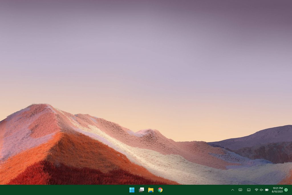
An array of buttons (except the ones I had!)
Woah, hold your horses there. I had more programs pinned than that. At least Steam. Plus the taskbar wasn’t as tall. Actually that’s a screenshot from after I cleaned up all the default crap I wasn’t interested in. I’m pretty sure the default was something like this:

Actually, let’s take a closer look at all that’s there…

Sarcasm aside (medically impossible for me), I think there’s a pretty good chance of people having no idea what icons 2-4 are (and possibly the the first one).
But fret not, dear readers, for I have produced an easy to understand guide as to what each button does:

Taskbar heights and you: enjoy your lack of space
Also about the height thing. It might sound petty, but it’s actually pretty important. Less interface bloat in your way, more room you have to work. That’s why the Surface (and a bunch of other devices) are getting 3:2 screens, so there’s more vertical space to work with. But let’s see how much space this takes up compared to my widescreen monitor, which needs the height even more:
Well I did say it was more important on the widescreen, didn’t I?
“But Slashee,” I hear nobody asking, “is it really fair to compare screens of different sizes and aspect ratios?”
Well, as a demonstration piece, sure, I’m pointing out the use of available real estate. But let’s look at what happens if I take screen size and aspect ratio into account, shall we?
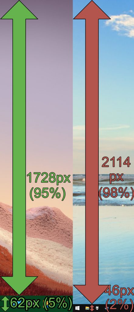
Right: 4K Desktop, W10

Right: 4K Desktop, W10
Yep, the smaller screen that probably needs more free vertical space… or space in general.
Given that you could (easily!) make it smaller in Windows 10 (like I have!), I can’t help but think of this as a regression… and not just because it’s ripping off macOS (dock at bottom of screen) AND Chrome OS (actually pretty much the same layout as Windows 11, but got there a few years earlier).
(Also I don’t know about you but holy %#$^ I didn’t realise how much bigger my 27″ monitor was compared to that)
Okay, so at least you can move the taskbar icons to the left and restore some sense. But why don’t I take advantage of my widescreen monitor and move the taskbar to the left? I mean it’s a lot like Windows 10. Just right click on the taskbar and you get a decent set of options, right?
Options (needed optional extra: glasses)
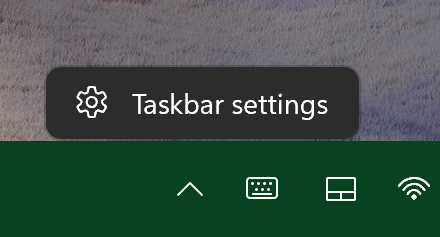
Oh, unless you enable the option to have transparency all over Windows. Then the menu “option” is still there, but you’ll have to take my word for it, unless your eyesight is pretty good.

Anyways, let’s get back to moving the taskbar. I guess it’s gotta be buried in the settings menu, right? They are trying to keep things simple, most people don’t care about all those options, so just point them to them instead of shoving them in your face.

Setting… probably doesn’t deserve a plural.

Umm. So I guess not. At least there’s the option to select the far corner to show the desk…. nope, that’s already in Windows 10.
But look at all the settings we do have compared to Windows 10!
Search buttonNews and interest buttons everyone immediately hid after they appeared in a patch.Single click options for arranging open windowsLock the taskbar so that I can’t accidentally move it
Okay, I was actually messing with you by saying there wasn’t an easy way to lock the taskbar into position. In Windows 11 there’s no way to move the taskbar, it has to be on the bottom, whether you like it or not. And it has to be big, whether you like it, not, or are willing to dig into the registry to change it. At least I still have the options to not combine taskbar buttons, automatically hide setting separately between desktop and tablet, hide icons for system functions in the system tray and to show a counter of unread notifications on taskbar buttons. That one’s a genuine life saver, Windows 10 just making the button orange when something had notifications was disrupting my entire “work”flow. Also MIA? Toolbars. I don’t mean the annoying Windows ME ones that covered half your taskbar with an animated Jeeves, I mean the kind where I can create a folder and next to the system tray there’s a label that says “Shortcuts” (just what I happened to name it, you call it whatever you want) with a » button next to it which opens a list with a few shortcuts I’ve made for stuff I want easily accessible, but not enough to pin it to the taskbar. Something a little like this:
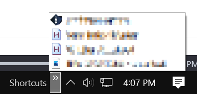
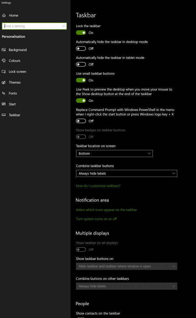
Not sure why the hell the option to replace PowerShell with command prompt is in there though (but it’s a nice option).
Progress! (just not in taskbar development)

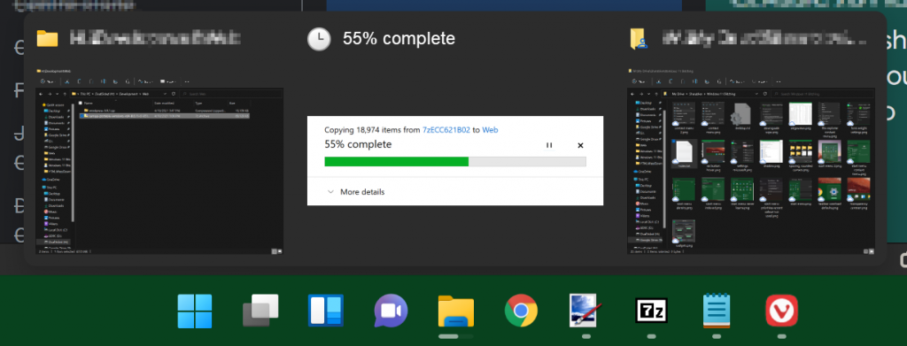
And there’s also a few more of the little things. You know those indicators on buttons in Windows 10 to show you how finished something is?
Well it’s still there… I think. I mean, if you look below the file mangler icon you can juuuuuuuust see a progress bar. With such a great contrast ratio, it’ll clearly be visible to the eyes of small insects who can get close enough to fill half their vision with each.
The Amazing Moving Buttons!
Yep, there’s more. And I know it might seem petty to rail on about the taskbar constantly, it is the biggest user-facing update.
The main reason setting the taskbar buttons to the left (other than when I set them to the centre to mock them)? I like things to be in the same place on a computer. Helps with muscle memory and such. For example, here’s where the start button is when I have a bunch of stuff open:

The exact pixels/percentage placement isn’t hugely important. It’s just that when you have a fresh boot and are looking to start stuff:

And about maths: yes, I know that 31 + 15 ≠ 45. Blame rounding.
So you’re always playing a game of “well where’s the button this time?!?!?!?”. The same applies to open programs, I have a few pinned to the taskbar in Windows 10, and… they’re always in the same spot as well.
Widgets?

Remember when I said earlier that there’s a button for widgets? Well, there is. I don’t know how to get it to do anything useful, though. Tried a few times, different times of day, after reboots, no dice.
Summary: it’s a mess. There are already programs out that make it look like Windows 10, and you know things are bad when they did the same thing to Vista.
Ads!
Okay, I know that they’re giving us a free upgrade, but developing software costs money. So does updating it with new features and security patches. But really, this, on an upgrade, when I have plenty of usage history and apps that were pinned to the start menu (which in Windows 10, once you’ve disabled all live tiles and removed most of what’s there by default). So I was excited to see how Windows 11 used all that. (Hint: it didn’t)
But at least they give us links to things every person uses every day, right? Let’s have a look:
Well actually this is the first place new Windows users go. To download Firefox or Chrome, of course.

Isn’t this where you’re supposed to get a cut of sales to keep development instead of shoving ads in our faces?
Unsure of usefulness, depending on case. There’s a reason I force install the Windows XP image viewer and use decent programs to actually edit or organise pictures.
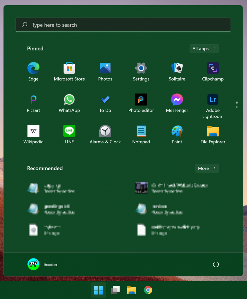
Bugs
Well sure, it’s technically an early access (or at least it was when I started writing this. Early by a week or two. Probably a wide-scale beta test on the gold master. So bugs… IMO shouldn’t happen.
- One time, any time I pressed a key with the start menu open, it just closed the start menu. Even if I manually clicked the search box, nothing. Required a reboot.
- A few times, typing things into the search box in the start menu (the only way to get to somewhere within an hour) it would refresh the results and highlight what was in the search box while I was in the middle of typing a word, so I’d delete what I’d done and had to go back and do it again.
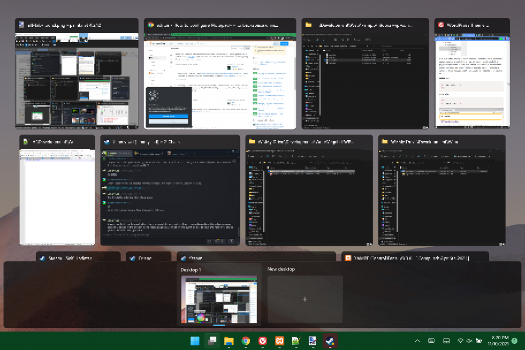
- I’m hoping this one is a bug so that I don’t have to add it to my major taskbar rant, but in task view, I don’t think your virtual desktop bar is meant to go over the bottom row of windows so that you can’t actually pick them:
